Role
Lead Designer
Lead Designer
Services
Product Design · Visual Design · Interaction Design
Product Design · Visual Design · Interaction Design
Overview | A competitive sector
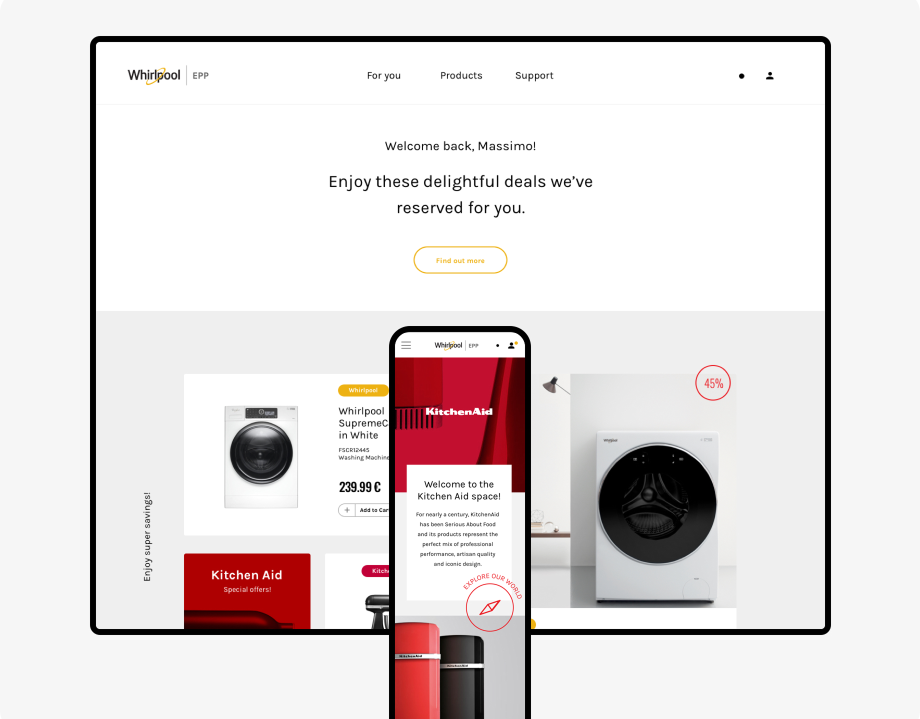
The Post Office Travel App faced fierce competition in the travel finance sector. Navigation was confusing, the visual identity inconsistent, and users didn’t fully trust the digital product. The redesign aimed to simplify key services, strengthen brand coherence, and create a reliable, engaging platform.
11k
downloads/month
+40%
digital transactions
4.8/5
customer trust and loyalty
The Post Office Travel App faced fierce competition in the travel finance sector. Navigation was confusing, the visual identity inconsistent, and users didn’t fully trust the digital product. The redesign aimed to simplify key services, strengthen brand coherence, and create a reliable, engaging platform.
Impact | Measurable growth in engagement
The redesign transformed a frustrating app into a confident companion for travellers. Users navigated with ease, engaged more, and trusted the brand. The app now feels effortless, professional, and visually cohesive, with adoption and retention on the rise.
The redesign transformed a frustrating app into a confident companion for travellers. Users navigated with ease, engaged more, and trusted the brand. The app now feels effortless, professional, and visually cohesive, with adoption and retention on the rise.
downloads/month
+40%
digital transactions
4.8/5
customer trust and loyalty
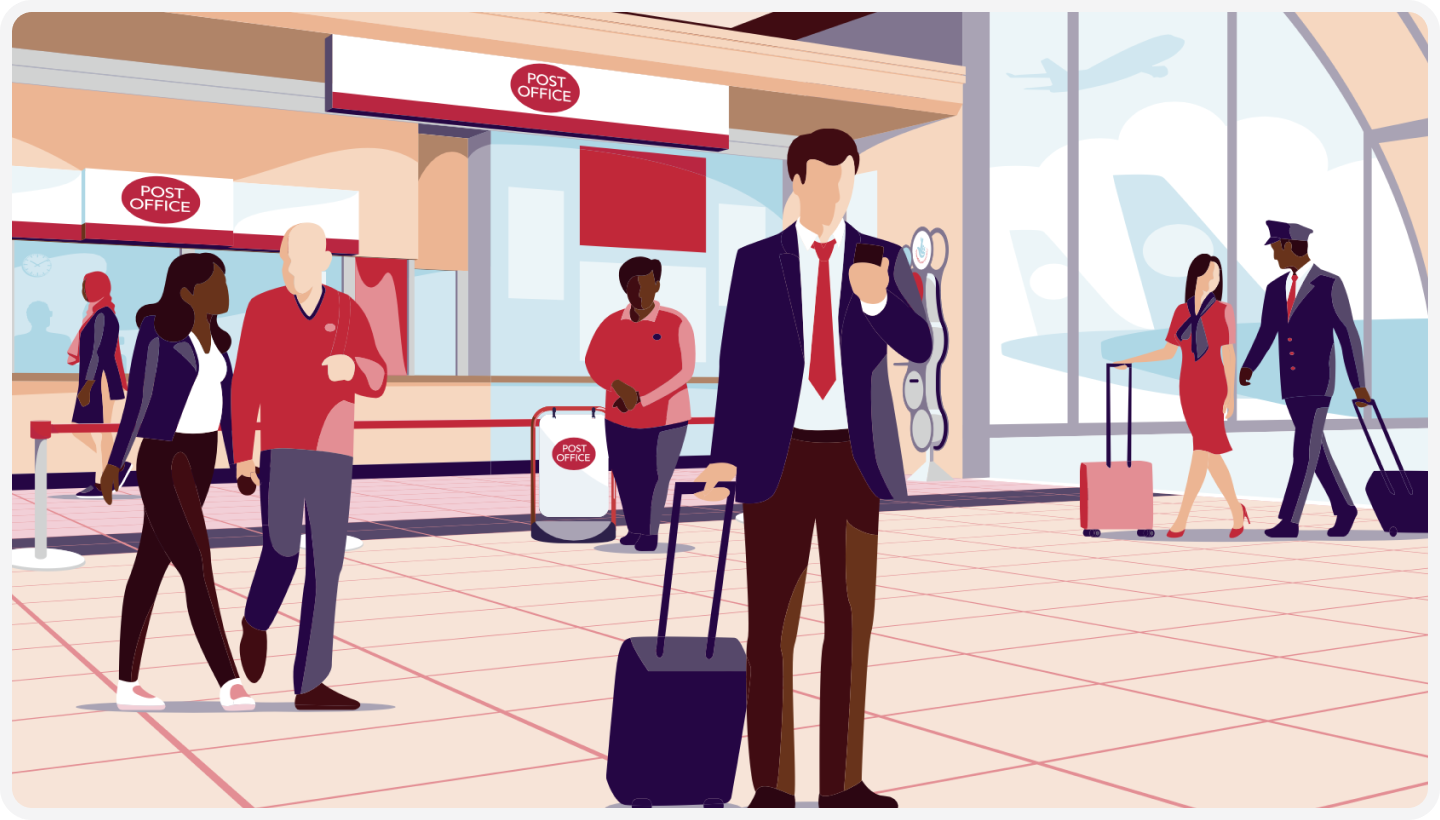
Challenge | From branches to digital
Users struggled with convoluted workflows, confusing navigation, and an outdated interface. Many still relied on physical branches for tasks that could easily be digital. The design failed to build trust in financial services.
Users struggled with convoluted workflows, confusing navigation, and an outdated interface. Many still relied on physical branches for tasks that could easily be digital. The design failed to build trust in financial services.
Goal | Trustworthy and intuitive journeys
Design an intuitive, visually cohesive travel app that simplifies services like currency exchange, travel cards, and insurance while enhancing user engagement and loyalty. And establish the Post Office as a competitive player in digital travel services.
Design an intuitive, visually cohesive travel app that simplifies services like currency exchange, travel cards, and insurance while enhancing user engagement and loyalty. And establish the Post Office as a competitive player in digital travel services.
Strategy | Balancing compliance and usability
We combined user research, competitive analysis, and client workshops to define the approach. Legal and compliance constraints shaped task flows, while insights from travellers’ pain points guided feature prioritisation. The focus was on clarity, trust, and seamless access to essential services.
We combined user research, competitive analysis, and client workshops to define the approach. Legal and compliance constraints shaped task flows, while insights from travellers’ pain points guided feature prioritisation. The focus was on clarity, trust, and seamless access to essential services.
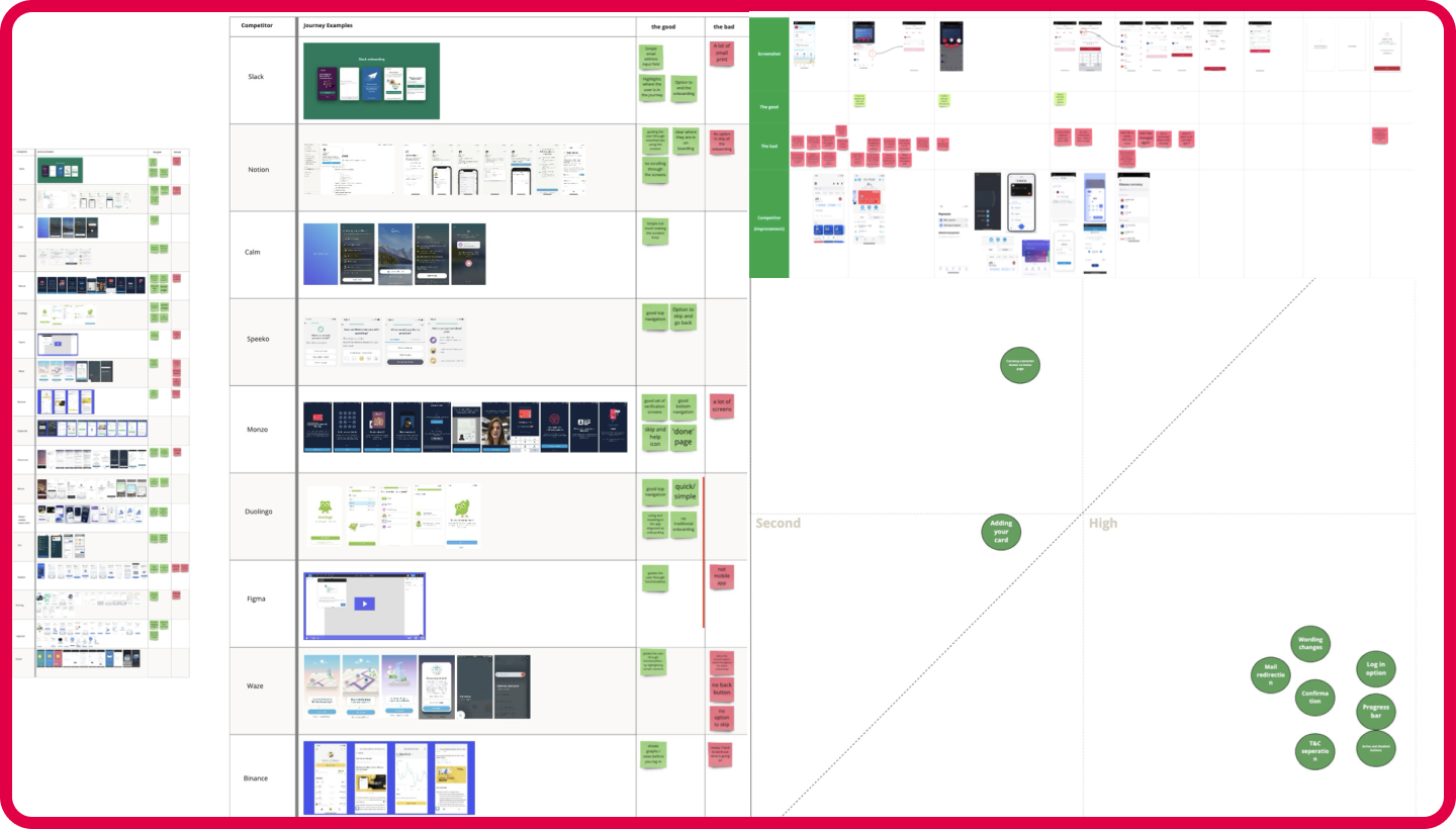
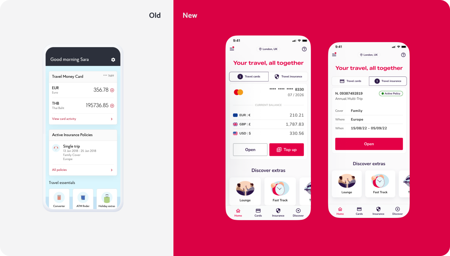
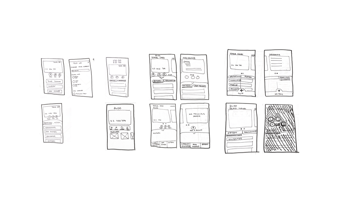
Research & Analysis | Pinpointing the pain
Primary research uncovered friction in travel card management and general navigation. Users found it difficult to locate services like currency conversion, insurance, and travel notifications. The outdated, childlike visuals reduced trust and perceived reliability.
Primary research uncovered friction in travel card management and general navigation. Users found it difficult to locate services like currency conversion, insurance, and travel notifications. The outdated, childlike visuals reduced trust and perceived reliability.
Design Principles
Simplicity
Trustworthy
Efficiency
Scalability
Trustworthy
Efficiency
Scalability
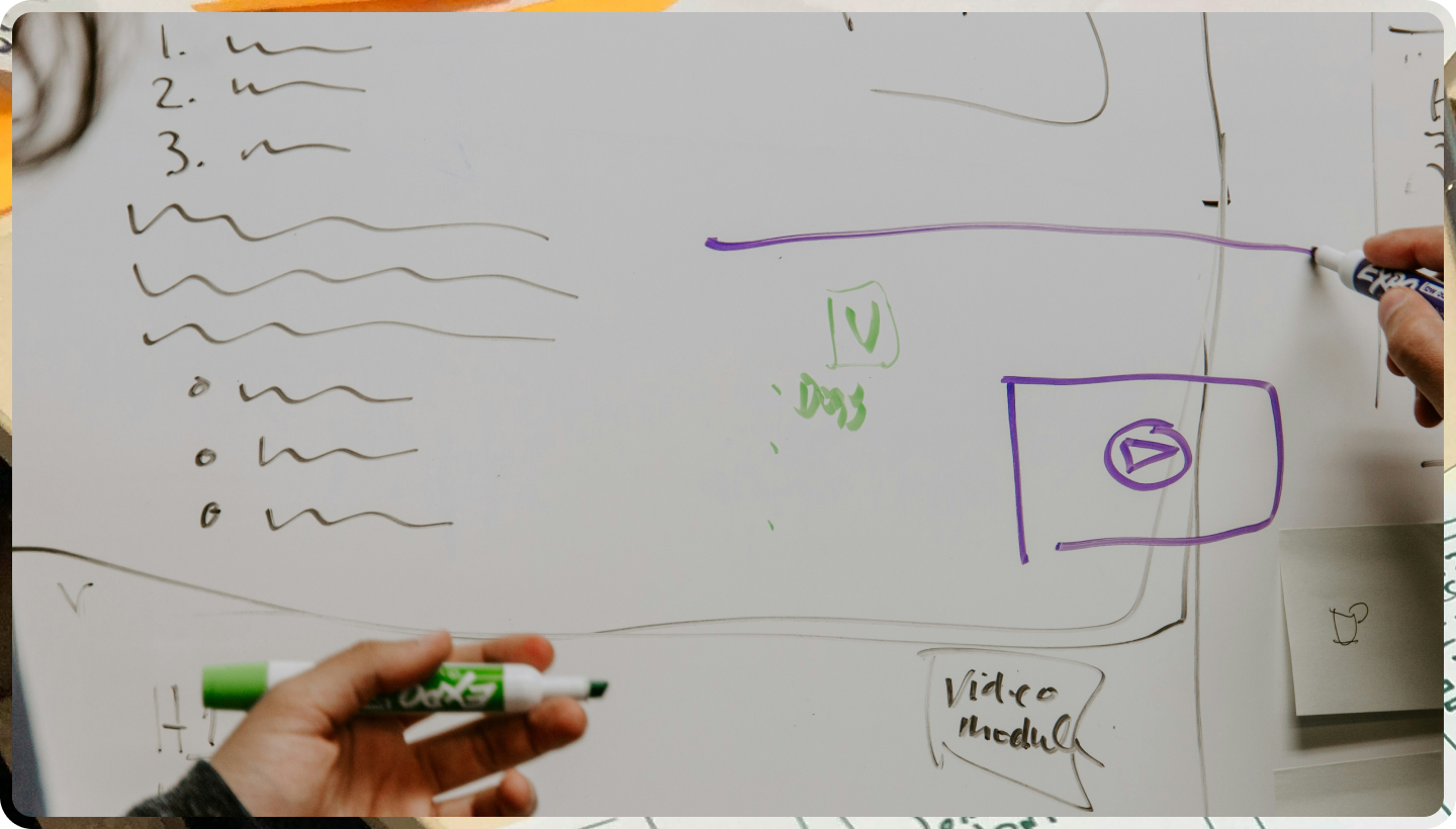
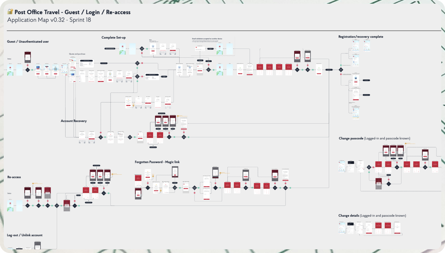
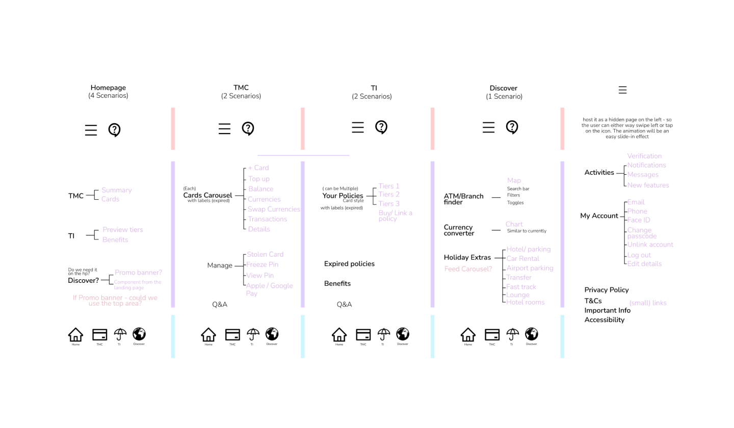
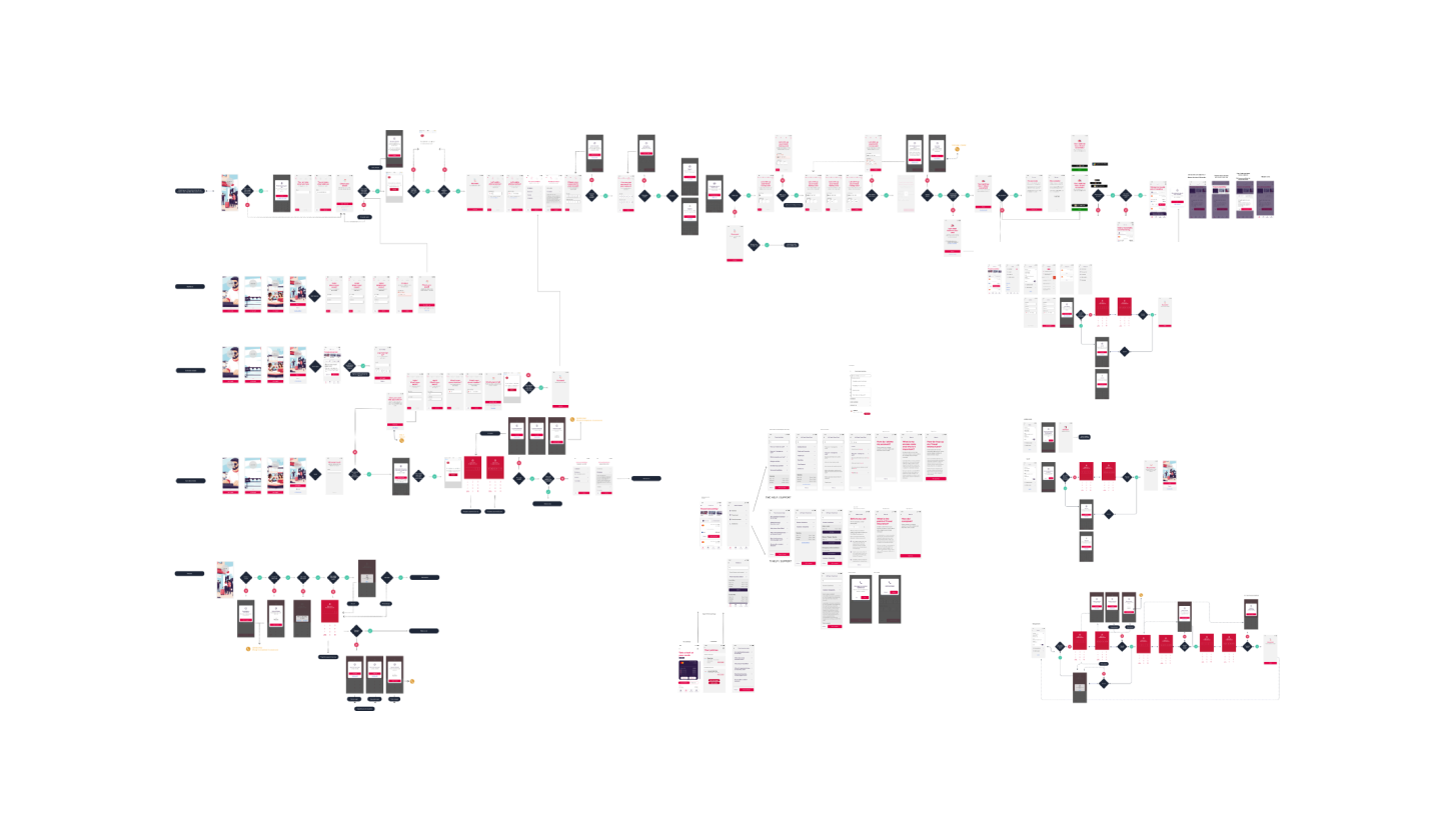
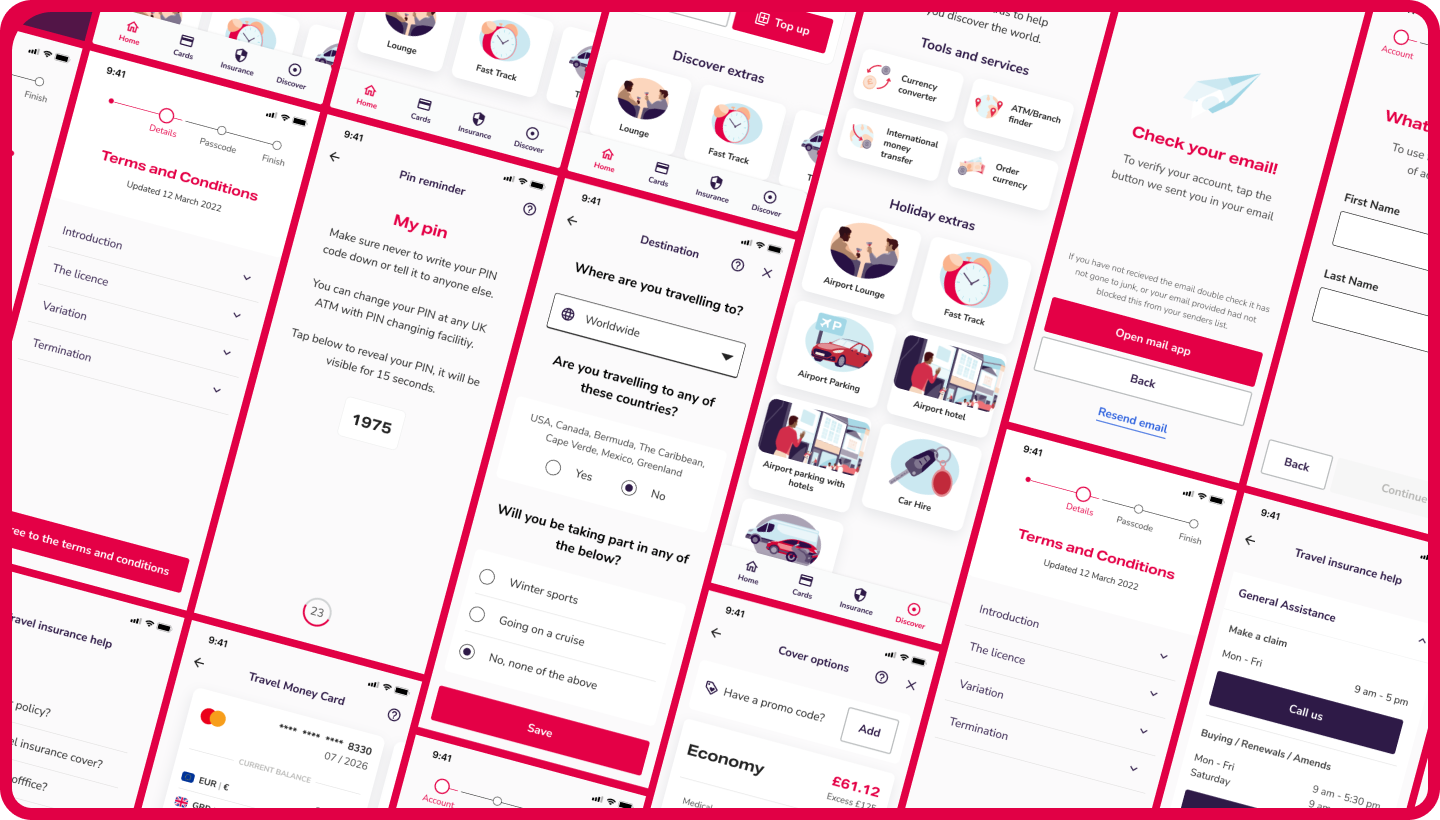
Ideation | Designing for simplicity
The app was reimagined as a cohesive ecosystem. Wireframes, content structures as well as user journeys were created to align storytelling with a contemporary, immersive experience. Micro-interactions, visual cues and icons
made complex tasks feel manageable and features like geolocation based and notifications were tested to enhance user experience and simplify tasks. Collaboration with compliance was vital to ensured feasibility.
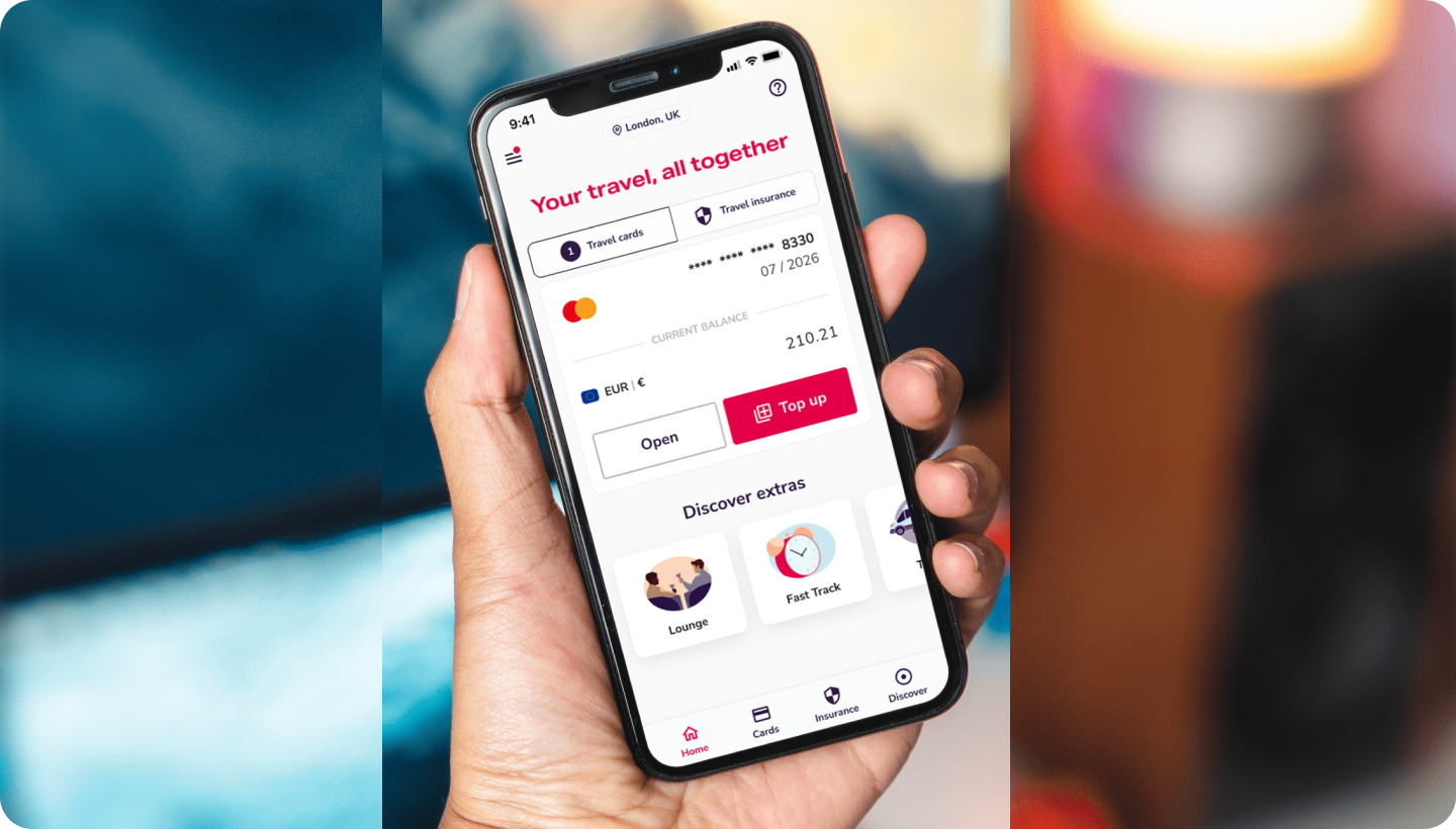
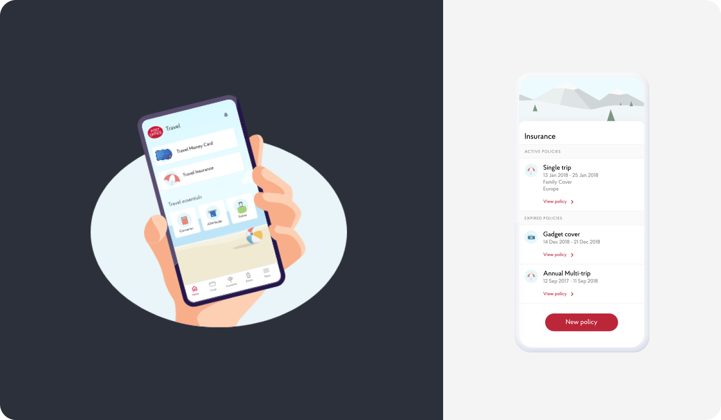
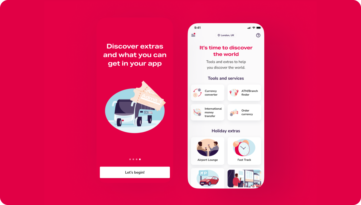
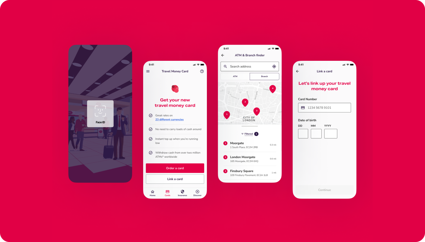
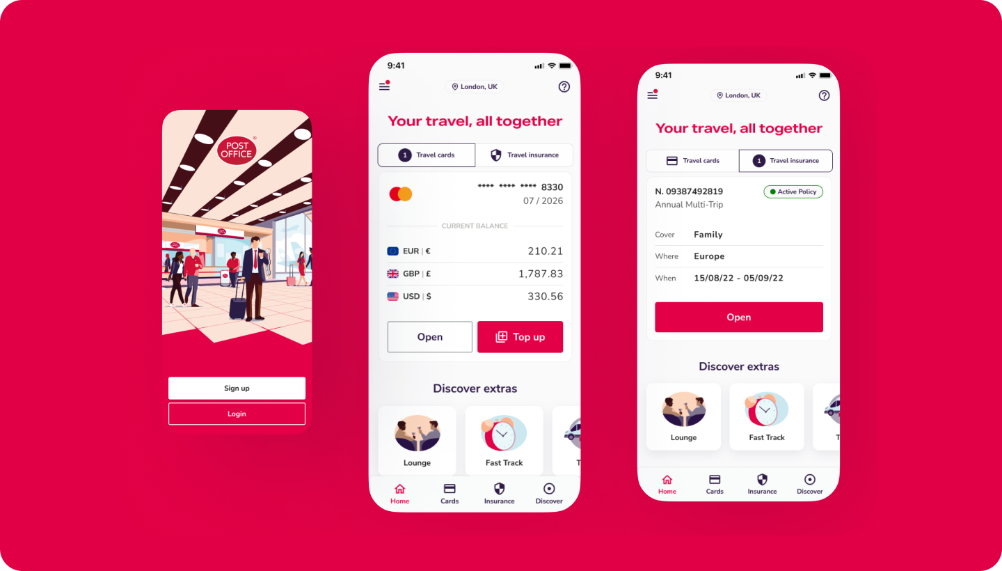
High Fidelity | Clean and in brand travel platform
A sleek, user-friendly app with simple workflows for travel cards, insurance, and currency exchange. Services including ATM locators, taxi booking, and airport lounge reservations are accessible within a few taps. Visually, the app balances usability with brand aesthetics, supported by a full design system of reusable components and guidelines for scalability.
A sleek, user-friendly app with simple workflows for travel cards, insurance, and currency exchange. Services including ATM locators, taxi booking, and airport lounge reservations are accessible within a few taps. Visually, the app balances usability with brand aesthetics, supported by a full design system of reusable components and guidelines for scalability.
Takeaways | Designing for trust in finance
This project proves that simplifying complex processes and reinforcing visual identity can turn user frustration into delight. The Travel App became a reassuring, engaging experience that users rely on.
This project proves that simplifying complex processes and reinforcing visual identity can turn user frustration into delight. The Travel App became a reassuring, engaging experience that users rely on.