Role
Digital UI Designer
Digital UI Designer
Services
Product Design · UX Strategy · Visual Design · Interaction Design
Product Design · UX Strategy · Visual Design · Interaction Design
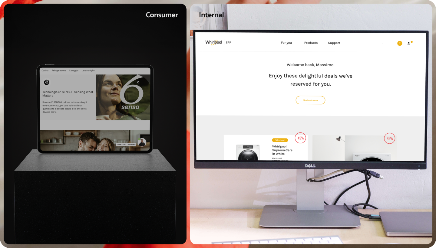
Overview | Bringing together all its perks
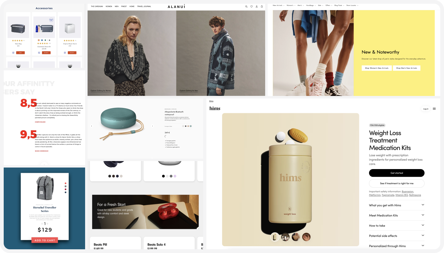
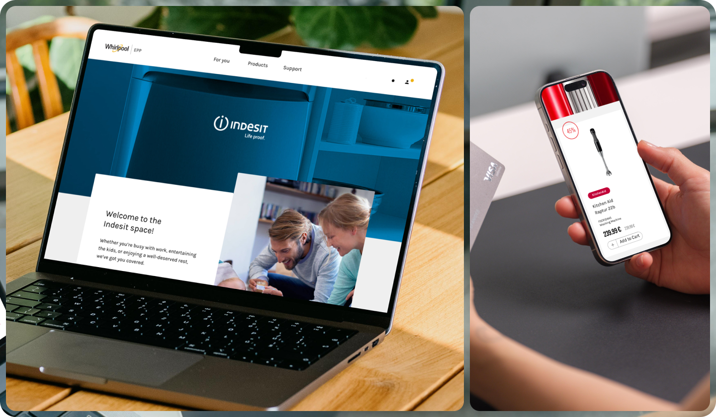
Whirlpool wanted to create an internal e‑commerce platform for employees, unifying all perks and product hubs in one place. Previously, each sub-brand had its own perks area, which made the experience fragmented and confusing. We designed the platform from scratch to feel engaging and VIP‑like while creating a personalised experience employees could connect with.
+35%
new purchases
-20%
abandonment rates
Whirlpool wanted to create an internal e‑commerce platform for employees, unifying all perks and product hubs in one place. Previously, each sub-brand had its own perks area, which made the experience fragmented and confusing. We designed the platform from scratch to feel engaging and VIP‑like while creating a personalised experience employees could connect with.
Impact | Foster a sense of community
The platform transformed the internal shopping experience. Employees reported feeling more valued and engaged. Behavioural-driven content and personalised messaging made the platform feel responsive, human, and VIP‑like, while ensuring cohesion across Whirlpool’s multiple sub-brands.
The platform transformed the internal shopping experience. Employees reported feeling more valued and engaged. Behavioural-driven content and personalised messaging made the platform feel responsive, human, and VIP‑like, while ensuring cohesion across Whirlpool’s multiple sub-brands.
new purchases
-20%
abandonment rates
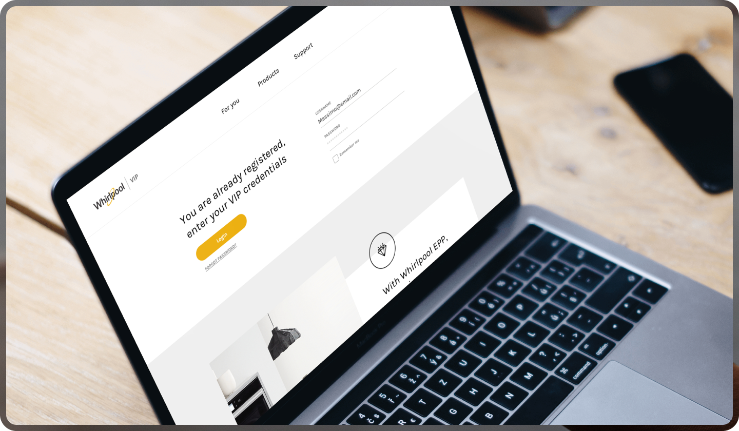
Challenge | Fragmented experience and low engagement
The main challenge was the fragmented experience. Different perks hubs existed for each sub-brand, making it hard for employees to engage consistently. There was a need to create a unified hub that allowed employees to interact with all perks and products in one place, feel valued, and navigate effortlessly.
The main challenge was the fragmented experience. Different perks hubs existed for each sub-brand, making it hard for employees to engage consistently. There was a need to create a unified hub that allowed employees to interact with all perks and products in one place, feel valued, and navigate effortlessly.
Goal | Clarity, consistency and connection
We wanted to build an in-brand platform that fostered a relationship with employees. Shopping needed to feel simple, intuitive, and personalised so every employee felt recognised and empowered to explore and purchase without effort.
We wanted to build an in-brand platform that fostered a relationship with employees. Shopping needed to feel simple, intuitive, and personalised so every employee felt recognised and empowered to explore and purchase without effort.
Analysis & Strategy | Data to inform the platform
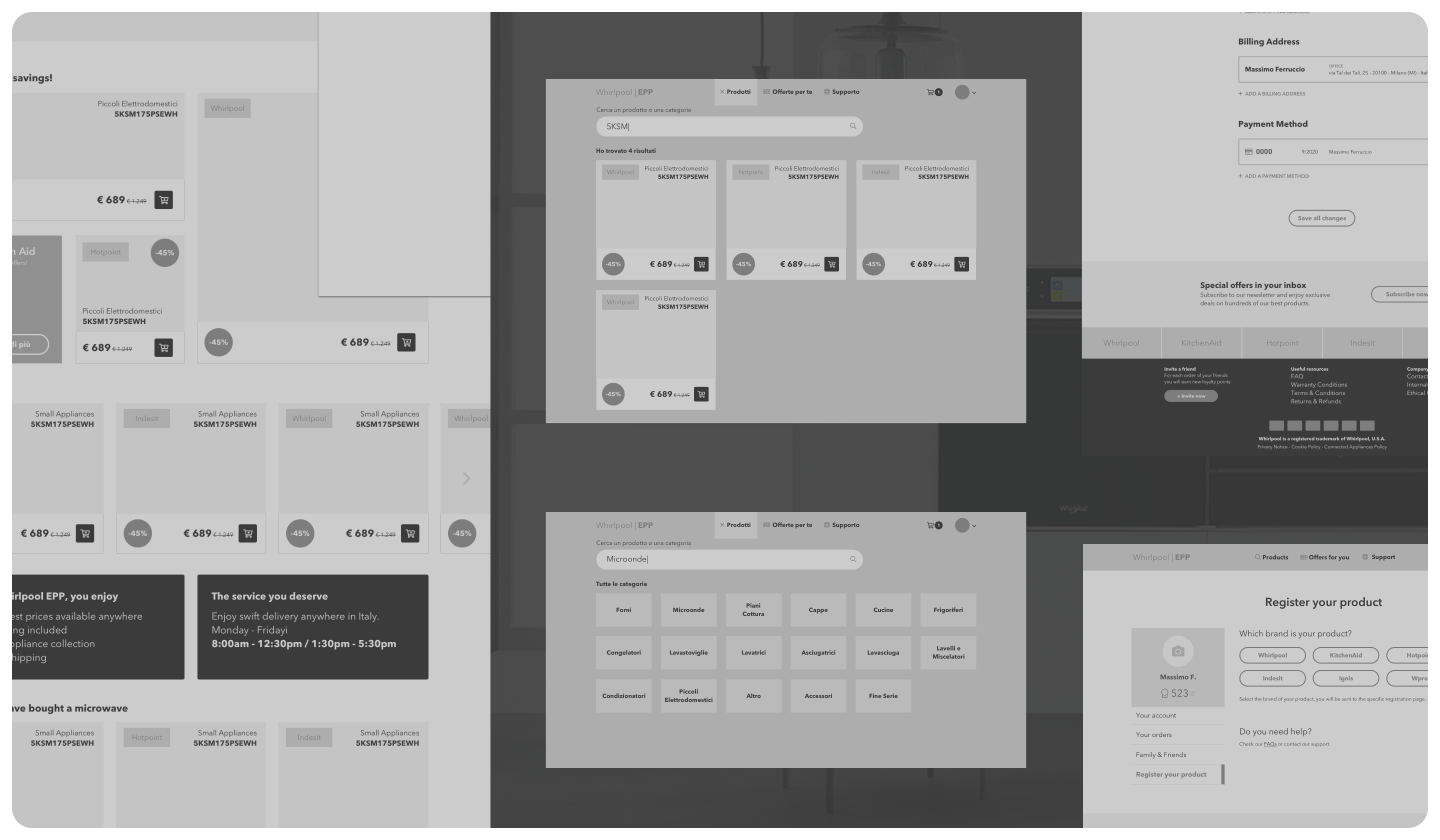
We started with a competitor analysis then gathered insights from the internal team, studying workflows, preferences, and employee behaviours. Behavioural data such as time spent on pages, past purchases, family status, and other indicators informed headlines, notifications, and content, making the experience feel guided and attentive. The UX designer focused on the main pages, and for the remaining pages, we relied on our design principles to define navigation, layout, and especially the checkout flow.
We started with a competitor analysis then gathered insights from the internal team, studying workflows, preferences, and employee behaviours. Behavioural data such as time spent on pages, past purchases, family status, and other indicators informed headlines, notifications, and content, making the experience feel guided and attentive. The UX designer focused on the main pages, and for the remaining pages, we relied on our design principles to define navigation, layout, and especially the checkout flow.
Design Principles
Community
Personalisation
Brand consistency
Streamline processes
Personalisation
Brand consistency
Streamline processes

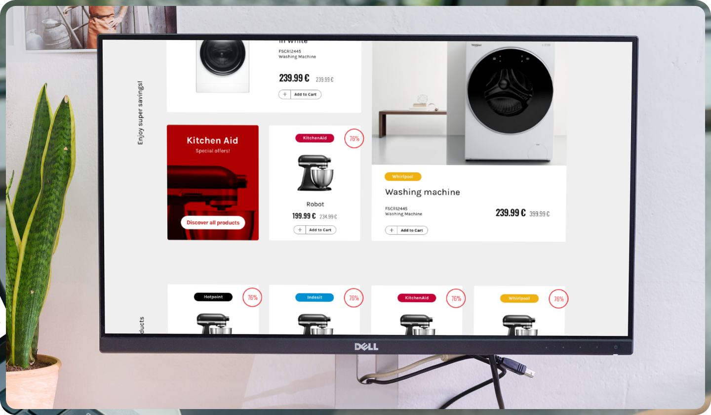
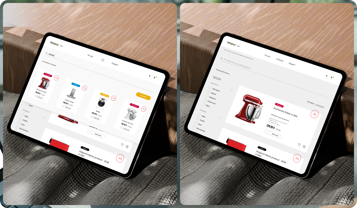
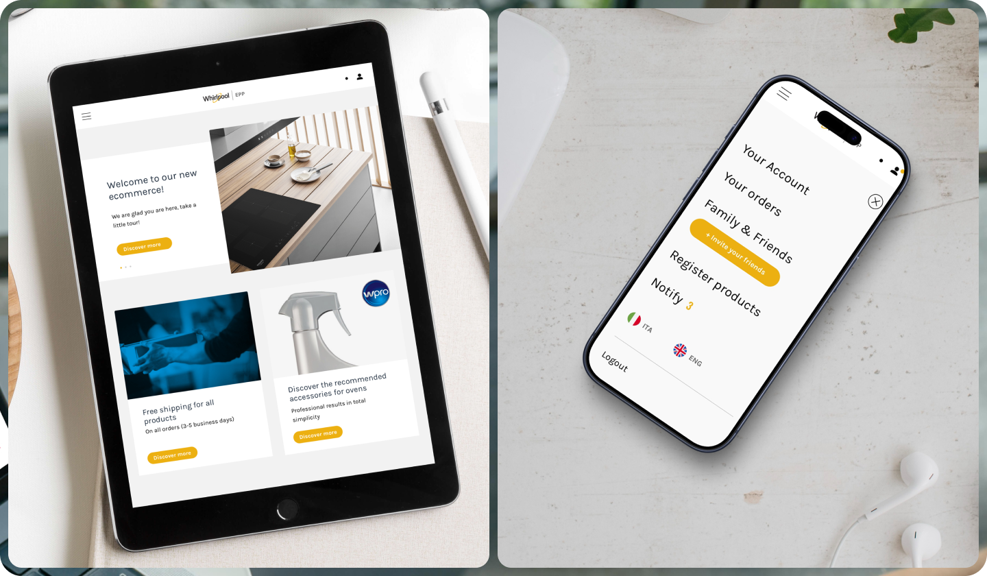
Ideation | From concept to interactive platform
Designing the platform visually was complex because five brands needed to coexist. We created a minimal and clean visual language that allowed each brand to express itself without clashing. A subtle touch of yellow referenced Whirlpool, the parent brand, while brand and product pages were free to communicate in their own tone.
Designing the platform visually was complex because five brands needed to coexist. We created a minimal and clean visual language that allowed each brand to express itself without clashing. A subtle touch of yellow referenced Whirlpool, the parent brand, while brand and product pages were free to communicate in their own tone.
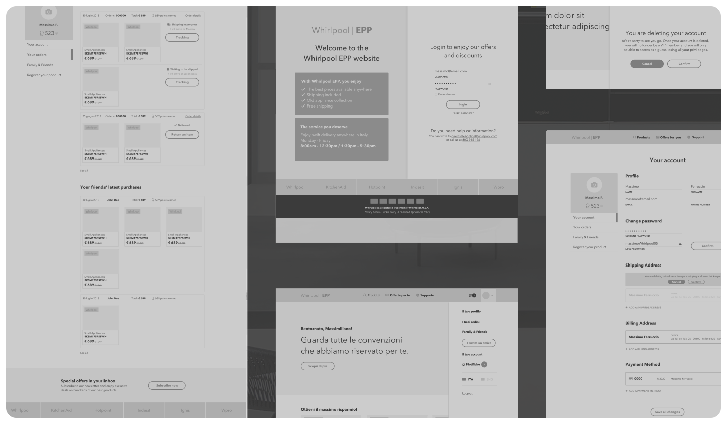
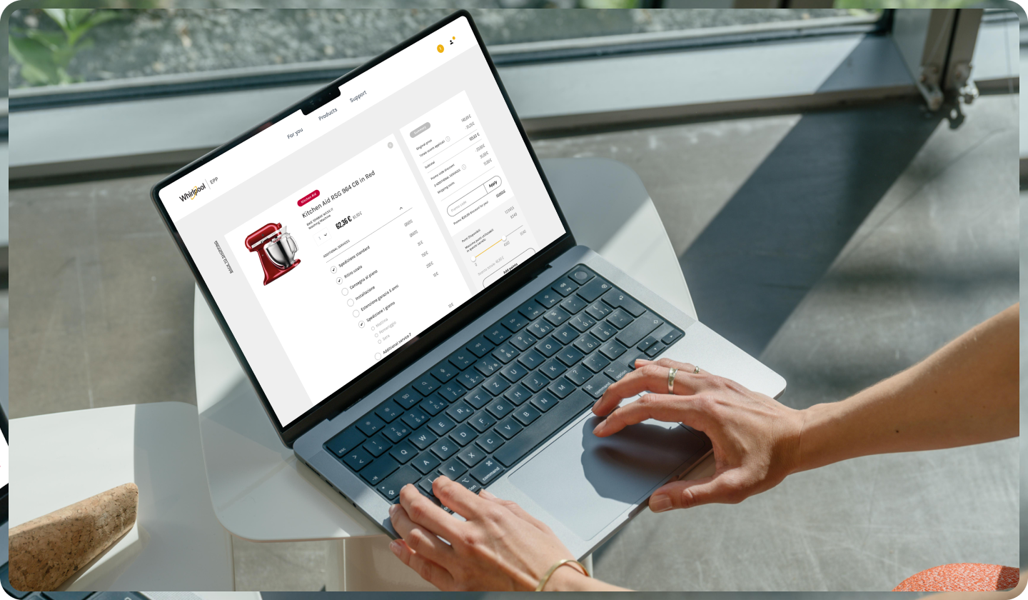
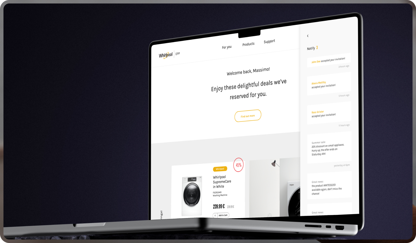
Design | Central hub & interactions
The homepage acted as a central hub for order history, support, and exclusive deals. The checkout flow was simplified to reduce friction. Micro-interactions and communication channels fostered collaboration and created a sense of community.
The homepage acted as a central hub for order history, support, and exclusive deals. The checkout flow was simplified to reduce friction. Micro-interactions and communication channels fostered collaboration and created a sense of community.
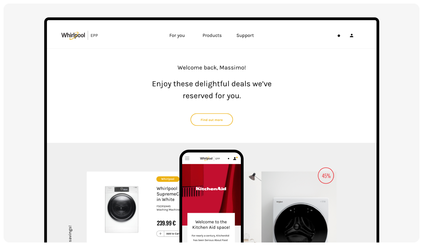
Design | VIP dashboard & personalisation
The VIP dashboard was personalised for each employee, showing relevant offers and products based on online behaviour and profile. Headlines, notifications, and prompts were designed to let them feel guided, supported with the human touch, reflecting each user’s context and actions.
The VIP dashboard was personalised for each employee, showing relevant offers and products based on online behaviour and profile. Headlines, notifications, and prompts were designed to let them feel guided, supported with the human touch, reflecting each user’s context and actions.
Takeaways | Know your users's behaviours
This project taught us the power of behavioural-driven personalisation combined with clear, minimal design. By observing how employees interacted with content, we created a platform that felt truly human and attentive. Even in a corporate intranet setting, empathy and careful attention to behavioural cues can transform routine interactions into meaningful experiences.
This project taught us the power of behavioural-driven personalisation combined with clear, minimal design. By observing how employees interacted with content, we created a platform that felt truly human and attentive. Even in a corporate intranet setting, empathy and careful attention to behavioural cues can transform routine interactions into meaningful experiences.